
GGRC Site
The Glenda Gordy Research Center
Making public crime data for Greater Houston feel trustworthy, accessible, and genuinely useful — for residents, journalists, and policymakers alike.
The Brief
A public face for rigorous research.
Crime Stoppers of Houston and The Glenda Gordy Research Center needed more than a website — they needed a public institution. The site had to establish credibility for an organization whose work depends on public trust, while making years of complex crime data feel genuinely accessible.
I designed and developed the full front end, building a visual system that could carry serious research content without feeling bureaucratic — and a navigation architecture that serves a wide audience from first-time visitors to policy professionals.
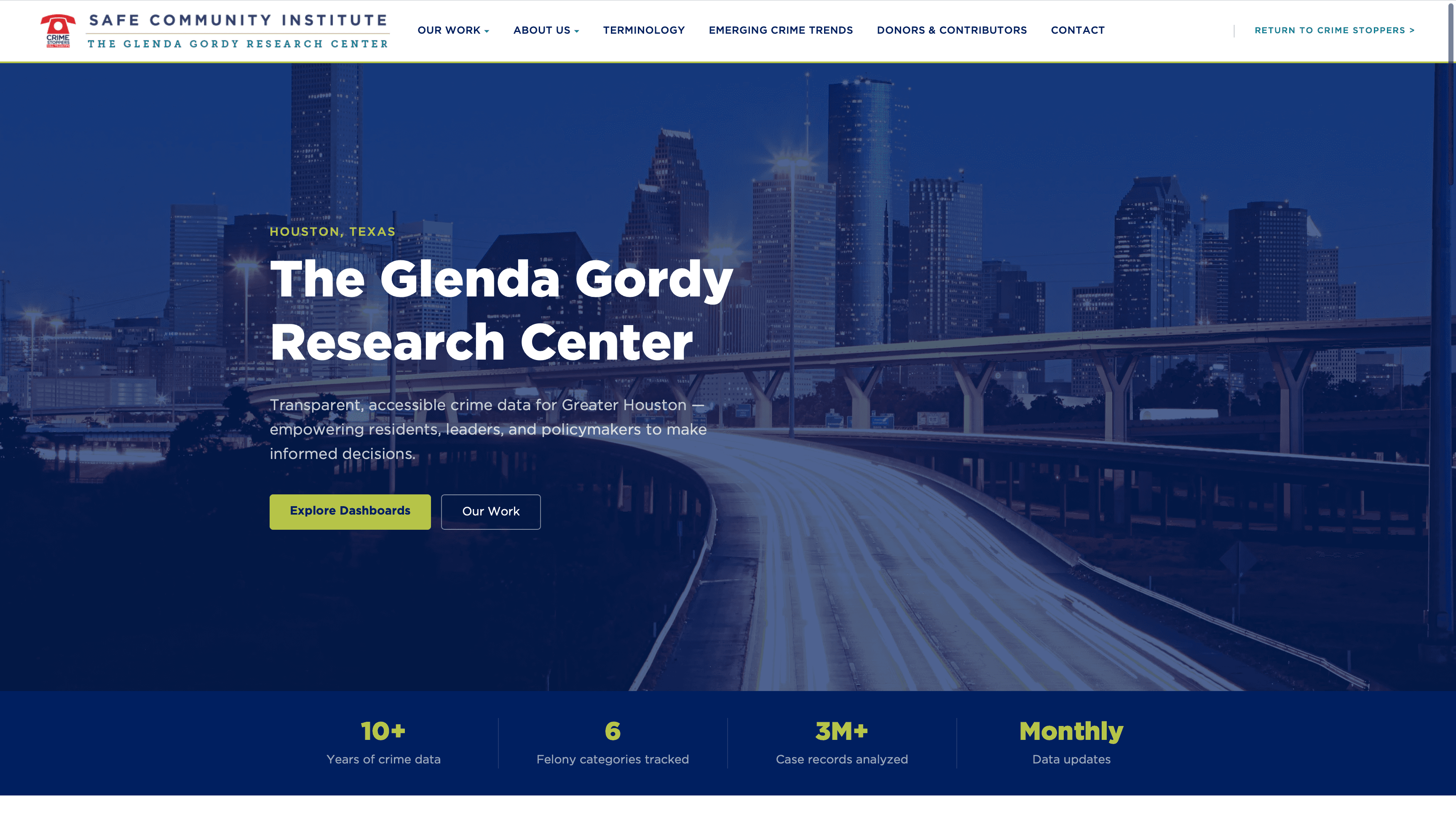
Homepage Design
Research Center
Design Challenges
The problems worth solving.
Authority vs. Approachability
Government crime data needs to feel credible and serious — but if it feels cold and bureaucratic, residents tune it out. The site had to walk a very deliberate line between institutional trust and genuine openness.
Information Density
The GGRC tracks 6 felony categories, 3M+ case records, and 10+ years of data. Surfacing that without overwhelming a first-time visitor required clear hierarchy and progressive disclosure — leading with meaning, not numbers.
Multiple Audiences, One Entry Point
The site serves Houston residents, journalists, researchers, and city officials. Each comes with different vocabulary and goals. Navigation had to be flat enough for anyone to get oriented in seconds.
Data ≠ Dashboard
The portal (the interactive data tool) lives at a separate subdomain. The main site's job was to tell the story behind the data — why it matters, who collects it, and what it means for the community.
Information Architecture
Six pages. No dead ends.
Every top-level page has a distinct audience and a clear exit — either into the data portal, a research artifact, or a contact point. The flat nav structure means no user ever needs more than one click to orient themselves.
Skyline hero, stat bar, intro to the GGRC mission
Research projects, dashboards, and published reports
Plain-language glossary of crime categories and legal terms
Editorially framed data stories for non-expert readers
Credibility-building acknowledgement of funding and affiliates
Research inquiries, media requests, and community questions
Our Work Page
Design Decisions
Every choice has a reason.
Dark hero with the skyline
Houston at night under a navy overlay immediately signals place and gravity. The dark canvas earns the site authority before a single word is read. Lime headings break through without softening the gravitas.
Lime = action and data, never decoration
Chartreuse lime is only used for stat callouts, primary CTAs, and key labels. It's never used for body text or backgrounds. That restraint keeps it meaningful — when lime appears, something important is there.
Stat bar as the first proof point
Immediately below the hero fold sits a row of four numbers: 10+ years, 6 categories, 3M+ records, monthly updates. These aren't vanity metrics — they establish that the research is ongoing, rigorous, and real.
Two CTAs, clearly differentiated
“Explore Dashboards” takes the filled lime treatment for users ready to dig into data. “Our Work” is outlined for those who want context first. The hierarchy matches user intent, not visual preference.
Color & Typography
A two-color system built on trust.
#0d1f4a
Deep Navy
Structure, authority, all backgrounds. The dominant color — reads as institutional without being sterile.
#a8bc2e
Chartreuse Lime
Data, action, signal. Used only for stat values, CTAs, and critical labels. Never decorative.
#ffffff
White
Clarity and breathing room. Text on dark backgrounds. Keeps content readable against dense navy.
Typography
Fredoka
Headlines & display type
Bold weight only. Approachable geometry that avoids feeling overly official — balances the authority of the navy palette.
Be Vietnam Pro
Body copy & navigation
Clean, legible at small sizes. Works across data labels, glossary entries, and long-form research summaries without fatigue.
Outcome
Public trust starts with design.
The GGRC site gives one of Houston's most important research institutions a presence that matches the rigor of its work. Residents can understand what the data means. Journalists can find what they need. Policymakers can cite the source. That's what good civic design looks like.
Accessible
Clear language, high contrast, logical nav — anyone can get oriented in under 30 seconds.
Authoritative
Navy visual system and institutional tone establish credibility before content is read.
Extensible
The design system scales: new reports, dashboards, and trend pages slot in without breaking coherence.
Live Site
See it live.
The full site is public — explore the dashboards, read the research, or just see how the design holds up in the wild.